Today I carried on editing the digipak and started on the front cover.
Firstly I changed the amount of shadows and highlights on the picture as I thought it needed more of a moody effect on it. I only adjusted it by a slight amount.
Also I decided to change the way that the tracks were listed, as I thought they were still too scattered and would look neater if they were all in line as a bunch and it would fit in better with the overall theme of the digipak with the words placed on top of each other.
I then added a barcode to the bottom left hand corner of the back cover to make it look more professional, and I also added next to it our Production Company logo - FancyVision. I also put the Copyright logo on it, and the year that the album was released.
I have now started to work on the front of the digipak. I am using another image which I took myself. It is of a wooden garage with the main singers guitar leaning up against it. The reason I chose to do this is because it tells a story of where the band are from, an urban city area which is a bit run down and rough. The guitar represents how much they are into their music and couldn't live without it.
I first changed the saturation down a little bit so that it was not as bright and colourful so it would match the back cover in regards to colours and moods.
I then changed the colour balance of the image, this was so that I could match it perfectly with the back cover. I added a slight amount of green, and a little bit of yellow, to achieve the greeny/browny colour which has been used throughout our music video and back cover so far.
However after comparing it with the back cover, I thought that it needed a bit more red to make it more brown rather than yellow. So I added a touch of red and a little bit more green and I got to the colour I wanted.
I then added a higher contrast to the image to highlight the darker parts of the image, like the minor details in the wood of the garage, and also the branches sticking out from the left bottom corner. Overall it looks more interesting like this.
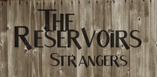
I then created new layers for each word of text to be put on to the front of the digipak. This would be 'The Reservoirs' - the band name, and 'Strangers' - the album name. I did this so they would be alot easier to move around to decide where they look best.
Firstly I changed the opacity of the words, so that they are not so bold and look as if they have been integrated in to the wood of the garage. This gives the 'rough and worn' effect that we are looking for.
These are all of the different places where I put the wording, and I had to try to decide which was the best one. After moving the text around numerous times I rotated it to see if this looked any better.
After thinking that the the text would look better on the left hand side at the top I thought I could try and flip the image, so that I could do this and the guitar (main focus of the image) would be on the right, and the image would be equaled out. This then looked a lot better.
After all I decided the text looked better with each word above each other, making it look more like a logo, and this looked more professional.


No comments:
Post a Comment