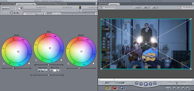
Today I went through each shot in the video and made sure that the colour correction was correct and visible in the shot. Some of them were still too blue or not blue enough, and the some of the narrative shots didn't look like they had any colour correction over the top of them.
In the outside beginning narrative shots we have put a browny/green colour over the top so it matches the wall and the ground and also the surroundings, I made sure that it was not too coloured but the colour correction is still noticeable.
In the performance shots where the band are on the balcony and in front of the white wall we have decided to keep with a blue colour correction, however have toned it down a bit so it is not too blue and so the shadows on the wall and ceiling stand out. We have kept it with this colour correction because there are no boxes in the background to distract the audience.
These outside shots with reddy/brown fence and wall have been colour corrected with the browny/green tint as well as the beginning narrative shots so that the colour theme/visual style is very similar throughout.
These are the shots where the background is very distracting and now have the same browny/green colour correction over them, which looks a lot better than having the blue because it blends in more with the narrative and isn't too different.
These shots where each individual band member is walking down the 'hallway' we have also left with a little bit of blue colour correction. I made sure that they were not too blue.
These shots at the end of the narrative were still too reddy/browny therefore I put more of a browny/green colour correction over them so that the match the rest of the outside shots.


No comments:
Post a Comment