Showing posts with label Digipak Construction. Show all posts

Thursday, 24 January 2013

Editing: 24/01/13

Today I carried on editing the digipak and started on the front cover.


Firstly I changed the amount of shadows and highlights on the picture as I thought it needed more of a moody effect on it. I only adjusted it by a slight amount.


Also I decided to change the way that the tracks were listed, as I thought they were still too scattered and would look neater if they were all in line as a bunch and it would fit in better with the overall theme of the digipak with the words placed on top of each other.


I then added a barcode to the bottom left hand corner of the back cover to make it look more professional, and I also added next to it our Production Company logo - FancyVision. I also put the Copyright logo on it, and the year that the album was released.


I have now started to work on the front of the digipak. I am using another image which I took myself. It is of a wooden garage with the main singers guitar leaning up against it. The reason I chose to do this is because it tells a story of where the band are from, an urban city area which is a bit run down and rough. The guitar represents how much they are into their music and couldn't live without it.


I first changed the saturation down a little bit so that it was not as bright and colourful so it would match the back cover in regards to colours and moods.


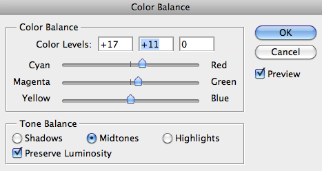
I then changed the colour balance of the image, this was so that I could match it perfectly with the back cover. I added a slight amount of green, and a little bit of yellow, to achieve the greeny/browny colour which has been used throughout our music video and back cover so far.
However after comparing it with the back cover, I thought that it needed a bit more red to make it more brown rather than yellow. So I added a touch of red and a little bit more green and I got to the colour I wanted.


 I then added a higher contrast to the image to highlight the darker parts of the image, like the minor details in the wood of the garage, and also the branches sticking out from the left bottom corner. Overall it looks more interesting like this.


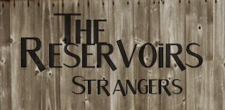
I then created new layers for each word of text to be put on to the front of the digipak. This would be 'The Reservoirs' - the band name, and 'Strangers' - the album name. I did this so they would be alot easier to move around to decide where they look best.


Firstly I changed the opacity of the words, so that they are not so bold and look as if they have been integrated in to the wood of the garage. This gives the 'rough and worn' effect that we are looking for. 
These are all of the different places where I put the wording, and I had to try to decide which was the best one. After moving the text around numerous times I rotated it to see if this looked any better. 


After thinking that the the text would look better on the left hand side at the top I thought I could try and flip the image, so that I could do this and the guitar (main focus of the image) would be on the right, and the  image would be equaled out. This then looked a lot better.


After all I decided the text looked better with each word above each other, making it look more like a logo, and this looked more professional.


Wednesday, 23 January 2013

Editing: 23/01/13

Today I started to work on the back of the digipak. I used the picture that I took myself of the tunnels for it.


I started by desaturating the image so that it had hardly any colour on it, so I was almost starting from scratch with the colouring to make it match the music video the best as possible.


I then changed the brightness and contrast of the image so that I could make it less bright and with more shadows in the dark parts of the picture, to give it the same mood as the music video. I gave it a high contrast, highlighting the shadows in the picture, which is the look I was going for.


After doing this I experimented with the hue and saturation. I didn't really need to desaturate it any more as I already had done it, so I only slightly did more. I put the hue up a little bit to make the picture slightly more greeny, as it already had the brown tinge.

  
I then edited the colour balance of the image, so that it would exactly match the colouring in our music video. The bricks in the picture originally had a reddy tinge so I needed to get rid of this as best as I possibly could. I added a little bit of green to the image and also yellow to achieve the greeny/browny colour which I did.


I then felt the image was ready to have the text put on to it, which is the name of each of the songs going on the album. I created a new layer for each bit of text so I could move the all around separately, and I named them with each of the song titles making it easier for me to know where to place them.


 I started by using the 'Skew' tool to tilt and move each of the titles, and I scattered them over the area of the bricks, however all of them didn't fit, and I didn't really want to make them any smaller as they would be quite hard to read.


Instead I decided to place them in lines on the bricks, which I think looked better. I also put the words in order of the shortest at the bottom to the longest at the top so that they all fit
in nicely.

Tuesday, 22 January 2013

Editing: 22/01/13


Today I started to play around on Photoshop with images which could possibly be used for either the front or the back of our digipak. I used a picture of a brick wall to start with, however is too simple, and doesn't say anything about the band or the character within the narrative. Therefore we may use a brick background behind 'The Reservoirs' for the website banner or logo.


Instead, I took this picture of tunnels, and cropped it to achieve the rounded curved shape above them leading into the brick wall. I would like to use this picture for the back of the digipak, and list the tracks within the bricks. However I would like to change the colouring so that it matches the music video.


Monday, 21 January 2013

Editing: 21/01/13

Today I researched some fonts that we may possibly use for our digipak and website.


This is my favourite font out of all of these as if is the most interesting and the 'S' curls down underneath the word.


These fonts are all quite basic, and I do not think they suit the band as much.

Friday, 18 January 2013

Digipak Drafts

These are my first ideas for our digipak. Both of these designs will have the band featured on the front, however we are more keen to have a photograph for the front of the album which tells a story about the band, and they can be seen inside the album.


I like the idea of both of these fonts for the main font used throughout our digipak and website. The first one is more simple which represents the band more than a fancy font as the band are laidback lads.